One of the first things you’ll notice about Caffeine’s website is that is very colorful and filled with all sorts of visuals. In some respects, it definitely resembles some of the popular social media platforms. This is a good tactic being that most the younger generations, also being their targeted audience, are already familiar with the look and feel of that environment. The biggest thing about creating a successful or popular website is it being easily accessible and easy to understand. When consumers have issues trying to use or navigate a website, most of the time they will just leave the website.
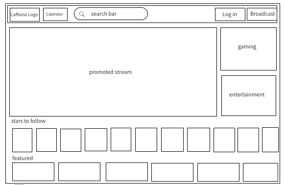
The first thing you notice is a video that is being promoted at the top. On top of the promoted video is where you’ll see the caffeine logo, the calendar, search bar, log in and broadcast link. I believe that these items are located in the ideal spot, where it will be easy to find and easy for new users to access. However, the calendar link is actually a small logo of a clock instead of a calendar. It would be a small, but useful, improvement for them to use an actual calendar logo or write out “upcoming,” or “calendar.” For me personally, the picture of the clock made me assume it was something to do with watching live streams from different time zones. However, it would be useful to make it as clear as possible for users to know what everything is without having to actually click on it.
When you click on the search bar to type, it shows the major celebrity streamers. I do like this idea; however, it could be improved by adding another section of suggestions with themes or popular searches here as well.
The overall layout of the website is complex. They try to organize their sections in rows, which as you continue to scroll becomes more overwhelming. As you scroll down, you see the content of the website. It starts with “stars to follow,” featuring some of their partners like Drake, Doja Cat and the Ultimate Rap league. I like this set up. I think it draws users in and makes them realize that big influencers also use this website. The next section is labeled “featured,” where they promote. The next section, labeled “trending,” is where is gets a little too busy and complex. Another point to note is that the majority of their gaming related sections are located towards the bottom of the page. I found this interesting being that their main target audience is gamers. It may be effective to have this section more towards the top of the website.
For more information of Caffeine TV, visit the link below!
https://www.caffeine.tv/broadcasting.html
Tags
Audience
Video Games
Caffeine
Sports
Entertainment
Hype Cycle Media
Twitch
Mixer
Social Media
